> ## Documentation Index
> Fetch the complete documentation index at: https://www.beeq.design/llms.txt
> Use this file to discover all available pages before exploring further.
# For designers
> Get the Figma library, understand design foundations, and start creating consistent product experiences with BEEQ.
export const CardTile = ({title, href, imageLightSrc, imageDarkSrc, children, enableImgZoom}) => {
if (!href) {
return
{imageLightSrc &&

}
{imageDarkSrc &&

}
{title &&
{title}
}
{children}
{title}
}
{children}
;
};
BEEQ gives you a single Figma file with everything you need to design consistent, accessible interfaces — design tokens, components, icons, and assets, all in one place. This guide walks you through setup and points you toward the things that matter most after that.
## Set up the Figma library
Getting BEEQ into your Figma workspace takes three steps. Once it's done, all components and variables are available across your projects automatically.
BEEQ ships as a **single Figma file** that contains Design Tokens/Variables, Components, and Assets (icons, illustrations, flags, logos). Everything lives in one place as of v1.0.
Request access to the main BEEQ Design System file, then duplicate it to your Figma workspace.
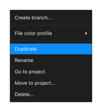 Open the main Figma file
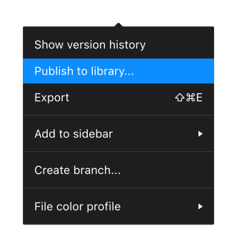
Open your duplicated file, rename it to something that makes sense for your team, then publish it as a Figma shared library via **Assets → Publish library**.
Open the main Figma file
Open your duplicated file, rename it to something that makes sense for your team, then publish it as a Figma shared library via **Assets → Publish library**.
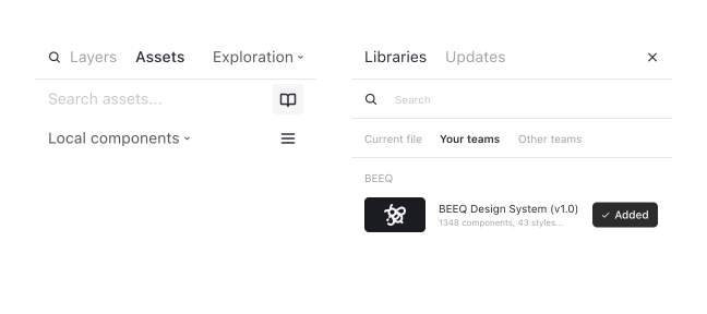
 In any project where you want to use BEEQ, open the **Libraries** panel and enable the library you just published. That's it.
 You're all set. BEEQ components, tokens, and assets are now ready to use across your projects. Happy designing!
***
Curious about how BEEQ is structured and why? The **[Design principles](/getting-started/design-principles)** page covers the Atomic Design methodology and the values behind the system.
***
## Theming and brand customization
BEEQ is built to be white-labelled. In Figma, brand customization happens through **Figma Variables** — change a token in the Theme Collection and every component that references it updates automatically.
### Figma Variables: three collections
BEEQ color tokens use Figma's variable capability and are split into three linked collections. Knowing which one to edit — and which to leave alone — is the key to customising without breaking anything.
| Collection | What it contains | Should you edit it? |
| -------------- | ----------------------------------------------------------------------------------------------------------------------------------------------------------------------------------------------------------- | ------------------------------------- |
| **Primitives** | All raw color scales (e.g. `iris-600`, `neutral-200`). 17 default hue sets plus any brand-specific additions. Colors are named `[color-name]-xxx`, from lightest (100) to darkest (1000). | No — reference only |
| **Theme** | Selects colors from Primitives and maps them to semantic slots: `brand`, `accent`, `neutrals`, `system`, and `data`. BEEQ ships with 5 built-in themes — BEEQ, Endava, and a ready-to-use **Custom Theme**. | **Yes — this is where you customise** |
| **Modes** | Wires Theme colors to component usage tokens (UI, Text, Icon, Background, Stroke, States) for both light and dark mode. | No — do not change |
You're all set. BEEQ components, tokens, and assets are now ready to use across your projects. Happy designing!
***
Curious about how BEEQ is structured and why? The **[Design principles](/getting-started/design-principles)** page covers the Atomic Design methodology and the values behind the system.
***
## Theming and brand customization
BEEQ is built to be white-labelled. In Figma, brand customization happens through **Figma Variables** — change a token in the Theme Collection and every component that references it updates automatically.
### Figma Variables: three collections
BEEQ color tokens use Figma's variable capability and are split into three linked collections. Knowing which one to edit — and which to leave alone — is the key to customising without breaking anything.
| Collection | What it contains | Should you edit it? |
| -------------- | ----------------------------------------------------------------------------------------------------------------------------------------------------------------------------------------------------------- | ------------------------------------- |
| **Primitives** | All raw color scales (e.g. `iris-600`, `neutral-200`). 17 default hue sets plus any brand-specific additions. Colors are named `[color-name]-xxx`, from lightest (100) to darkest (1000). | No — reference only |
| **Theme** | Selects colors from Primitives and maps them to semantic slots: `brand`, `accent`, `neutrals`, `system`, and `data`. BEEQ ships with 5 built-in themes — BEEQ, Endava, and a ready-to-use **Custom Theme**. | **Yes — this is where you customise** |
| **Modes** | Wires Theme colors to component usage tokens (UI, Text, Icon, Background, Stroke, States) for both light and dark mode. | No — do not change |
 Edit the **Theme** collection only. The Modes collection is what components read at runtime — changing it directly will break light/dark mode behaviour.
### Building your color palette
When using BEEQ on client projects, it's usually required to adhere to the client's brand guidelines. Those guidelines typically focus on the physical aspects of the brand — stationery, print materials — rather than digital. You'll need to expand them to cover all the semantic color slots BEEQ uses before you can customise the system.
Edit the **Theme** collection only. The Modes collection is what components read at runtime — changing it directly will break light/dark mode behaviour.
### Building your color palette
When using BEEQ on client projects, it's usually required to adhere to the client's brand guidelines. Those guidelines typically focus on the physical aspects of the brand — stationery, print materials — rather than digital. You'll need to expand them to cover all the semantic color slots BEEQ uses before you can customise the system.

 Build each of the following scales before opening Figma Variables:
* **Brand palette** — a full light-to-dark scale for the primary brand color
* **Accent palette** (if needed) — the same light-to-dark scale for a secondary highlight color. In BEEQ's default theme the accent slot is unused
* **Neutral palette** — a custom grey scale, if the brand specifies its own neutrals. Leave this out to keep BEEQ's defaults
* **System colors** — shades for success, warning, error, and info
* **Data colors** — a set of distinct hues for charts and graphs
Substitute the default colors from the **Theme Variables**, or introduce a new **Mode** for multi-theme projects, using the **Local Variables Panel**. Then follow the [Changing brand colors](#changing-brand-colors) steps below to wire up the specific brand variables.
There are many color generators available online to help you build palette scales. Tools like [Radix Colors](https://www.radix-ui.com/colors), [uicolors.app](https://uicolors.app), and [Huetone](https://huetone.ardov.me/) can produce perceptually uniform, accessible scales from a single brand hex.
### Changing brand colors
There are three brand color variables you'll need to update for any client or product:
| Variable | Purpose |
| ------------- | ------------------------------------------------------------------------------ |
| `brand` | The main brand color. Used on primary buttons, active states, and highlights. |
| `brand-light` | A lighter tint for hover states, muted backgrounds, and accents in light mode. |
| `brand-dark` | Dark mode replacement for `brand-light` — usually a deeper shade. |
To change them: open the **Theme Collection** in Figma Variables, find the brand variables, and update the value to a hex code or pick a swatch from the **Primitive Collection**.
Build each of the following scales before opening Figma Variables:
* **Brand palette** — a full light-to-dark scale for the primary brand color
* **Accent palette** (if needed) — the same light-to-dark scale for a secondary highlight color. In BEEQ's default theme the accent slot is unused
* **Neutral palette** — a custom grey scale, if the brand specifies its own neutrals. Leave this out to keep BEEQ's defaults
* **System colors** — shades for success, warning, error, and info
* **Data colors** — a set of distinct hues for charts and graphs
Substitute the default colors from the **Theme Variables**, or introduce a new **Mode** for multi-theme projects, using the **Local Variables Panel**. Then follow the [Changing brand colors](#changing-brand-colors) steps below to wire up the specific brand variables.
There are many color generators available online to help you build palette scales. Tools like [Radix Colors](https://www.radix-ui.com/colors), [uicolors.app](https://uicolors.app), and [Huetone](https://huetone.ardov.me/) can produce perceptually uniform, accessible scales from a single brand hex.
### Changing brand colors
There are three brand color variables you'll need to update for any client or product:
| Variable | Purpose |
| ------------- | ------------------------------------------------------------------------------ |
| `brand` | The main brand color. Used on primary buttons, active states, and highlights. |
| `brand-light` | A lighter tint for hover states, muted backgrounds, and accents in light mode. |
| `brand-dark` | Dark mode replacement for `brand-light` — usually a deeper shade. |
To change them: open the **Theme Collection** in Figma Variables, find the brand variables, and update the value to a hex code or pick a swatch from the **Primitive Collection**.
 Figma doesn't currently support Typography variables, so **color is the only way to theme BEEQ in Figma**. Typography customization is handled at the code level through CSS variables.
### Going beyond colors
If a project requires more than just color changes — say, a rounder button corner radius — you can add custom tokens to the Theme Collection. Create a token (e.g., `button-roundness`), assign different values per theme, then replace the default token on the component. The same pattern works for other properties like spacing and shadow.
The **[Theming and Modes](/theming/themes-and-modes)** and **[Global CSS Variables](/theming/global-css-variables)** pages explain how the token system works across both Figma and code — useful reading if you're working closely with a developer on a custom theme.
***
## Explore design foundations
The BEEQ visual language — colors, type, spacing, and the rest — is documented in the Foundations section. These pages describe the token values, the rules for using them, and the reasoning behind the choices.
The color system, semantic tokens, and how light and dark mode work.
Fonts, scale, line heights, and when to use each style.
The spacing scale and how it maps to design tokens and component layout.
The BEEQ icon library, sizes, and usage guidance.
The *why* behind BEEQ's visual decisions is covered on the **[Design principles](/getting-started/design-principles)** page.
***
## What to do next
* Browse **[Components](/components)** to see all available building blocks, with interactive examples and usage guidelines.
* Explore **[Theming](/theming/themes-and-modes)** to understand how customization works beyond the basics.
* Review recent changes in the **[Changelog](/releases/changelog)** to stay up to date.
* Reach out at [beeq@endava.com](mailto:beeq@endava.com) or open a discussion on [GitHub](https://github.com/Endava/BEEQ/issues) if you get stuck or have a question.
Figma doesn't currently support Typography variables, so **color is the only way to theme BEEQ in Figma**. Typography customization is handled at the code level through CSS variables.
### Going beyond colors
If a project requires more than just color changes — say, a rounder button corner radius — you can add custom tokens to the Theme Collection. Create a token (e.g., `button-roundness`), assign different values per theme, then replace the default token on the component. The same pattern works for other properties like spacing and shadow.
The **[Theming and Modes](/theming/themes-and-modes)** and **[Global CSS Variables](/theming/global-css-variables)** pages explain how the token system works across both Figma and code — useful reading if you're working closely with a developer on a custom theme.
***
## Explore design foundations
The BEEQ visual language — colors, type, spacing, and the rest — is documented in the Foundations section. These pages describe the token values, the rules for using them, and the reasoning behind the choices.
The color system, semantic tokens, and how light and dark mode work.
Fonts, scale, line heights, and when to use each style.
The spacing scale and how it maps to design tokens and component layout.
The BEEQ icon library, sizes, and usage guidance.
The *why* behind BEEQ's visual decisions is covered on the **[Design principles](/getting-started/design-principles)** page.
***
## What to do next
* Browse **[Components](/components)** to see all available building blocks, with interactive examples and usage guidelines.
* Explore **[Theming](/theming/themes-and-modes)** to understand how customization works beyond the basics.
* Review recent changes in the **[Changelog](/releases/changelog)** to stay up to date.
* Reach out at [beeq@endava.com](mailto:beeq@endava.com) or open a discussion on [GitHub](https://github.com/Endava/BEEQ/issues) if you get stuck or have a question.